This collection was articulated through out the year. I have investigated mainly into branding. I have explored commercial and popular culture and graphic design within this sector.
Frank Ocean Publication Branding


The publication explores a scanning technique. I applied this technique into my "Tone it Down" brief. This technique is very expressive and allows to convey the message of diversity. This has helped me develop as a designer by exploring branding which supports diversity.
Azeema Mag

Azeema Mag is a publication which empowers women of colour. I have collected every edition of this publication range. On the back page the designer has applied a visual of a palm tree. This gave me the idea for my logo for my brand. The publication explores issues such as otherness and the Nadia Murad case with the Genocide with Yazidis. This helped me find issues within the people of colour community. This helped me find an issue for the Alone Together competition brief.
Ivy Park Logo
Ivy Park is an activewear clothing line co-founded by American recording artist Beyoncé and London based fashion retailer Topshop, introduced in 2016.
The font used for the logotype of the clothing Brand is Aktiv Grotesk Black. Aktiv Grotesk is a contemporary grotesque sans-serif typeface released by Dalton Maag in 2010 (Dalton Maag, 2019). The san-serif typeface works effectively as it conveys a sense of strength, power, and assertion.
The scale variation addresses the idea of diversity and hierarchy. Furthermore, the Monochrome scheme works effectively, as it is simple for a complex design. This design approach has created an urban aesthetic towards the brand. Also, the layout is centred which works effectively and acts as a focal point, it draws the audience's attention in. To improve this design further perhaps the gap between the two words could be spaced out more or joined together as the gap is very thin and in my opinion becomes too compacted. Overall, the branding is strong, conveying power and strength. The characteristics of strength establishes a sense of confidence which relates to the context of sports and fitness, as the brand sells activewear. Consequently, the colour scheme is successful as it is simple for a complex design but also helps address the message of diversity and black culture.
This research will help develop my practice further by initiating a contemporary brand which explores the theme of diversity. The typeface being in capitals will help initiate a sense of confidence towards the brand, this will be considered when designing.The branding will address black culture through an urban aesthetic, this relates to the Ivy Park logo. I will further this research by exploring other graphic designers who have explored diversity.

This research has been the most beneficial in steering projects and designs to create a more urban feel towards my practice. The campaigns use photography. his research into the angle of how the camera has taken the photos has helped develop my skill as a photographer.

Jasmin Sehra
Jasmin Sehra is an Alumna of London College of Communication in Graphic Design and Media Design. Sehra bases her work on identity, empowerment, self love, and positivity through er brand paradise girl. Sehra has incorporated her Punjabi heritage, fashion and arts by her illustrations , typography and design.
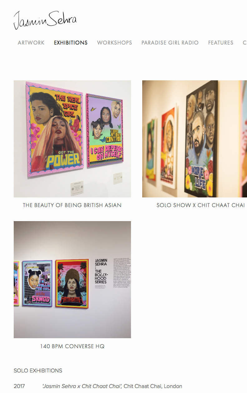

Researching in Jasmin Sehra's online presence by her online website portfolio.

Image from the Bollyhood series.
Jade Laurice


Jade Laurice has been one of my main inspirations. She creates cookbooks, designs clothes and paints. She has also collaborated with fashion and beauty brands and modelled for music videos. Her online portfolio is very active and I inspire to brand myself like this in the future. I will achieve this by creating look-book editorial posts and create my own paintings.
Bare Vintage
Bare vintage consisted of 24 pages, showcasing some of Lauren Sissons and Gus Walsh's 2016 photography for Bare Vintage. Launched first pop up shop in 2015. Laura Sissons also designed the IVY PARK campaign.


I researched into her online website. The website was very clean and highlighted different projects which Lauren Sissons has worked on. She also has a photography website with her partner. The use of having two different websites allowed the websites to be focus and concise.

Rashid Babiker
Rashid Babiker designed the visual identity for Jorja Smith, a logo which can be used for screen, digital, print, stage and cloth. The aesthetic was between the gothic "Comic" as used in "Fire starter" by Stephen King and the more cubic, muted "Clarendon" which was used on Jazz Records through the 50's and 60's. Barbiker collected photo from books and online which inspired him. The designer used @Fontsquirrel to identify the fonts. There were 32 fonts experimented.

Rashid Babiker shares his design process on Twitter. This helped me in structuring a design process for the branding for an emerging artist brief.

https://twitter.com/rashidbabiker/status/1001192425870774272?lang=en
Only One Mono
Only One Mono designed the IAMDDB logo. The designer started out emailing emerging artist and would ask to design their logo. The designer started this at the age of sixteen and would charge 20 pounds for each design.

This research has encouraged me to reach out to emerging artists to gather work experience for my CV.
No comments:
Post a Comment